Mark Egge
Transportation data derring-doer @ High Street.
Providing high-octane data analytics to the agencies that build and operate America’s transportation networks.
View My LinkedIn Profile | Read My Blog
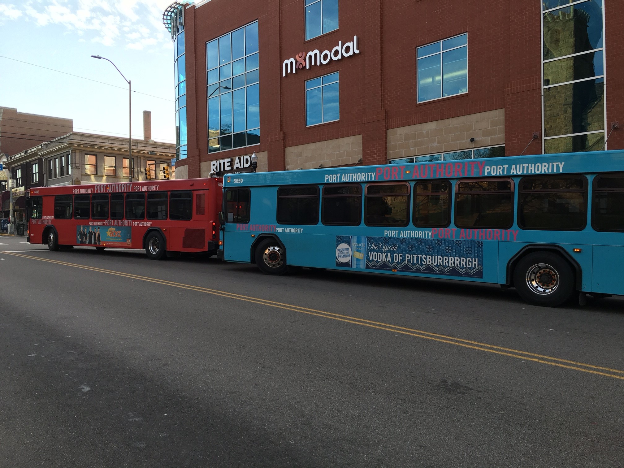
THE WHEN AND WHERE OF PITTSBURGH’S BUNCHED BUSES
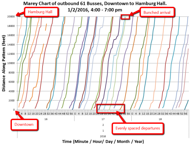
Having previously established that Pittsburgh’s buses do bunch and a technical platform for archiving and accessing historic bus service data, I sought to extend this inquiry by quantifying aspects of frequency, timing, and location of bus bunching. The resulting project is available online at:
DATASET
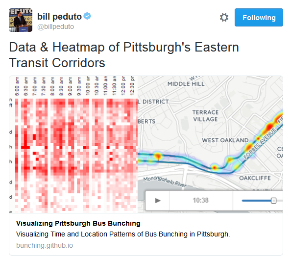
Vehicle locations for all buses servicing routes 61, 71, P1, and G2 were recorded once every sixty seconds throughout the month of March, 2016, resulting in a dataset of some 1.5m records of timestamped bus locations. Each location data point is processed to measure the minimum distance to the next closest bus operating at the same moment on the same route in the same direction. If less than 250 meters away from the next bus servicing the same route, the point is classified as “bunched.”
Across all routes, approximately 18% of all data points were “bunched.” With only 5% of observations bunched, Route G2 is the best performer among our selected routes. Route 71A measured worst, with over 26% of all observations bunched (most bunched P1 observations are attributable to observations near the terminals on either end of its run).
VISUALIZATION
In hopes of finding patterns to shed some light on the bunching phenomenon, I created two distinct visualizations: a chart showing the proportions of bunched trips, and an animated map showing the spatial-temporal distribution of system-wide bunching throughout the course of the day.
For the proportional view, time and space are bucketed—time into 10 minute windows, and space into 1000 foot segments along the bus’s route path. The portion of bunched observations is calculated for each bucket. To make this coherent to system users, the vertical axis is labeled with the neighborhood boundaries crossed as the bus progresses.
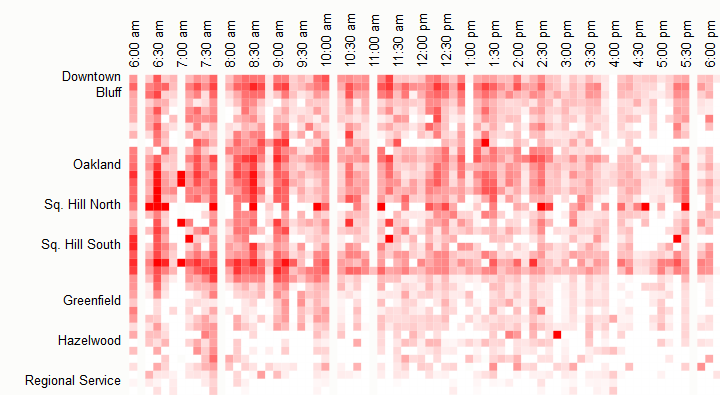
Visualized in this manner, clear horizontal lines emerge corresponding with areas of congestion (e.g. the intersection of Forbes Ave and Murray Ave is the obvious band between South Squirrel Hill and Greenfield).
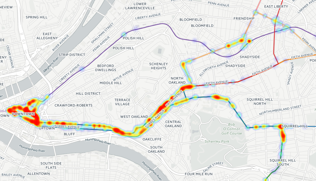
The proportional visualization can only display one route at a time. Gaining a 10,000 foot, multi-route view requires a heatmap and a timelapse. Fortunately, CartoDB has an “off the shelf” tool to build exactly such a visualization. Daily observations for March 1 – 31 were combined by time of day. The resulting heapmap shows all routes in the project at once, or the user can zoom in and look any specific area (e.g. comparing compare the patterns along Forbes Avenue (outbound 61) and Fifth Ave (inbound / outbound 71 and inbound 61).
RESULTS AND RESPONSE
Both visuals show that trends location is more deterministic of bunching than time of day. I was surprised by the limited impact of rush hour (or the persistence of bunching outside rush hour), and the dramatic difference between the on-street routes of 61 and 71 versus the busway routes of P1 and G2. (When the Port Authority suggests it wants to build a busway through Oakland, it’s easy to see why.)
The project was shared by Pittsburgh’s excellent Eat That, Read This. From there, the project was picked up and shared out by several local civic organizations, including Pittsburgh mayor, Bill Peduto.
I’ve also had occasion to speak with several news organizations, and to present the visualization on several occasions. While my project hasn’t ended the bunching problem, I’m humbled to get to contribute to the conversation about Pittsburgh’s transportation needs. The Port Authority of Allegheny County has subsequently incorporated the animated heat map visual into its outreach materials making the case for a BRT route through Oakland.
PRESENTATIONS:
- [2017/04/12] Bunching visualization used in the Port Authority’s Public Outreach on BRT presentation
- [2016/11/09] BRT in Pittsburgh: a potential solution – Port Authority Transit Blog 2.0
- [2016/11/02] How can Port Authority tackle a common public-transit problem? – Pittsburgh City Paper – Stephen Caruso
- [2016/09/21] Bus Bunching (Presentation). CMU Transportation Club
- [2016/09/08] Data Projects With SUDS (Presentation). Students for Urban Data Systems